Note: there is not a one-size-fits-all solution for improving UI. As we move into an increasingly connected world that has seen the most significant shift to online since WWW was introduced- it is now even more crowded and competitive.
Getting in front of consumers ahead of your competitors has never been easy. And now, thanks to social media platforms like Instagram, Facebook, Snapchat and Pinterest, social and online presence have become one of the most vital parts of a business today.
What is UI?
The user interface is the website’s design that supports the user’s experience (UX) when browsing. Therefore, almost all website elements, including buttons, search bars, CTAs, icons, and text layout, can be considered UI design elements.
Researching and refining how your users interact with your site is a great place to start to boost conversions and generate more leads. User experience ensures users find valuable services and products on your site as efficiently as possible.
For all businesses, one of the main aims is to generate more sales. More sales equate to steady growth and better financial outcome. UI, along with UX, plays a vital role in this growth.
There are some fundamental components of UI that make for a more effective website when placed together.
The site’s usability and its visual design and interaction design affect users’ interpretations and use of a site. Therefore, the site’s information architecture is vital as it ensures users can access the information they need.
Wireframing is an integral part of UI. It is a visual guide representing the site’s design framework, outlining how buttons, tabs, and menus respond to users’ actions. It helps to make sure users can easily navigate throughout the website.
When building a substantial brand value and reputation, businesses must emphasise a high level of user satisfaction across all areas, including the website. As e-commerce continues to grow, online shoppers have higher expectations when it comes to the online experience. Therefore, online stores opt to push to satisfy the needs of their customers as the top priority.

The need for a brand to get its online presence and site right has never been more critical than now. In addition, a well researched and thorough UI can effectively grab consumer attention and enhance user experience, thereby improving ROI.
UI Design Elements
UI elements of a website consist of parts and elements that designers use to improve the development of apps and websites.
An online study found that improving a site’s navigation may help increase the conversion rate by as much as 18.5%. Therefore, all websites must pay attention to the UI and UX. Here is a look at four practical ways to improve UI:
1. Improve conversion with persuasive CTA
A highly effective call-to-action (CTA) button does what it says on the tin and helps to deliver a direct yet straightforward statement for the user. In addition, it gives clear directions to the user concerning what to do next, and upon clicking the button, it provides the users with the idea that they are visiting a different website.
With great design and UI that is simple yet catchy, CTAs are crucial as they guide consumers into the sales funnel where conversions happen.

With a focus on mobile users, presenting a large area responsive to a tap or a click on a call-to-action button is essential to leading the user to the right destination.
Unfortunately, many buttons on a website are purely graphical and embed small link texts, which work well for viewing sites on a desktop but are not very mobile-friendly. Designs like this can cause frustration to users and deter them from using a website altogether.
Also, we advise you to use a standard colour of red for each type of call-to-action button. If your website visitors get used to a particular colour for a specific button, they will subconsciously be more attached to it.
When designing a template, make sure to pick the right colours for each type of CTA button. If a call-to-action button is too small and not clickable, chances are there will be fewer clicks, and conversion rates can drop significantly. Make sure that all-important links incorporated into the button are identified quickly and have a correct anchor.
Tip: Do not play around with button colours too much. If your “Get Started” button is colour blue, try keeping everything consistent (i.e. avoid using a different colour for the same button on a separate page) – this may confuse the user.
2. Use white spaces effectively
The first step in improving conversion rates is to pay attention to the psychology of colour.
Make it the goal to remove all excess clutter and noise from a page. Then, replace the white space with the images that matter. Adding a background image to one page is possible, but it is essential to ensure it doesn’t distract users from the aspects you want them to see.
White spaces allow users to scan the website smoothly without being too distracted by any clutter or unnecessary elements on the page. White areas are a great way to increase click-through rates. For this reason, keeping an adequate amount of white space on a page can lead to more leads and a higher conversion rate.
Furthermore, white spacing makes information on the page look more clear and defined.

However, using colour in the right way can be tactical leverage for any business with this in mind. Using colours is effective to help focus the user’s attention to specific parts of the page and work well for actionable elements such as CTAs.
Tip: Using warmer tones like orange and yellow attracts the eyes the same way red does, expanding against darker, colder tone colours such as blue and green. Highlighting these crucial elements of the page ensures they do not get lost.
3. Link padding
Anchors and links present on the site by default are usually the same size, keeping in line with the rest of the elements on the page. Unfortunately, this means they can only span that specific area to remain clickable, such as the height and width of the text.
Expand the clickable area for superb usability of the link. Adding extra padding to the text can also be done by converting the link into a block element, making it appear more extensive and inviting.
You can use the following simple code to increase the padding of the link:
a {

display: block;

padding: 6px;

}
A larger area will, for obvious reasons, be more clickable and easier to use. This method also makes these links more mobile-friendly, giving users less chance of missing the link. Converting links into blocks also helps make the text area span the entire width of the box, making the theme ideal for sidebars.
Adding a healthy amount of padding to the link is essential as it ensures the link itself is visible enough to be clicked.
Tip: Do not overuse padding on text links (i.e. links that are not buttons). These may confuse and frustrate mobile users when scrolling down. Users can accidentally click the link without intending to do so.
4. Design based on users
Sometimes it is easy to get carried away with designing your new website. However, it’s increasingly important to offer your user what they want compared to what your business thinks they might like. Thinking about the consumer, what they need, and the types of things they would look for will help construct a better, well-thought-out website tailored to users’ needs.
A timeline indicating progress on the site is one of the best UI elements to include on a site. The timeline helps users understand where they are in the sales funnel and essentially helps them in and out sooner.
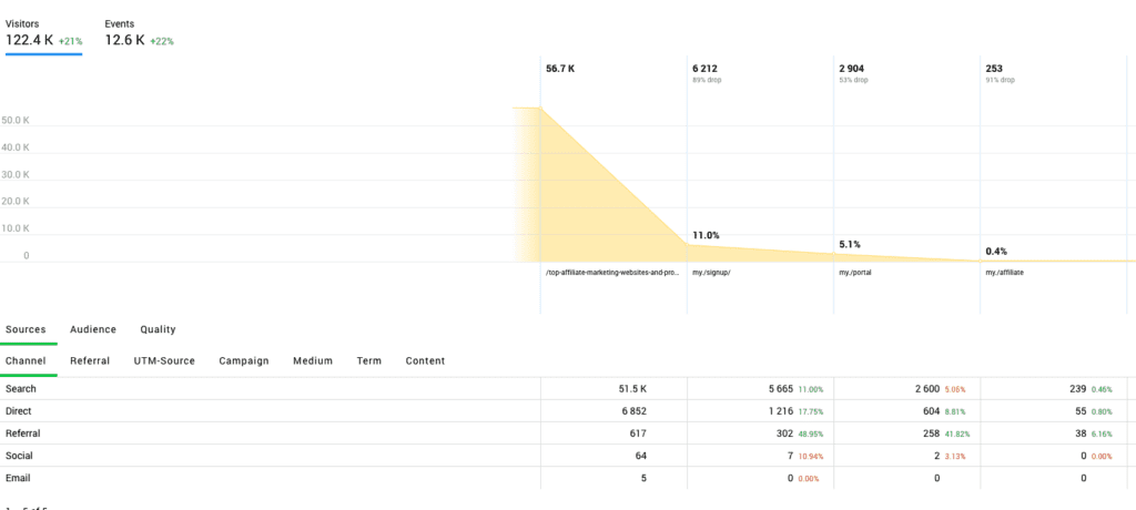
Use tools like Google Analytics and Finteza to determine the pages your users stay on, how they go from page to page and where they drop off.

Unfortunately, design elements are of much concern to users. Yes, they help make sites look attractive. Still, the baseline is that consumers want to get things done in the shortest amount of time with the least amount of hassle and frustration. A good design will have all these elements integrated. In addition, the easier the sales process can be, the more inviting it is for users, giving them a positive shopping experience and making them more likely to come back.
Tip: Use heatmaps to determine the website areas where your users seem to be focusing most. Determine the areas that need tweaking, then use them to display the most important CTAs.
One of the main points to consider when creating and having a website is that it needs to constantly be updated to work best for those interacting with it. Make sure to run tests and audits, helping you keep on top of the competition.
Open-source technology, by definition, is software anyone can use and modify for free. It gets developed by a community…
Auditing your performance is a standard business practice. Regular performance reports let you know what you’re…
Although the productivity of a group depends much on members’ motivations and skills, certain organizational…
Content Copyrights Belong to The Author. All Rights Reserved.
We're A Dallas Digital Marketing Agency That is Experts At Social Media Marketing, Website Design and Emarketing and Promotion.


